Learn how to build a responsive website with HTML and CSS
Step 1: Set Up Your Folder Structure and Code Editor
Before we start coding, let’s set up a clean folder structure for your project and configure a code editor. This will help you keep everything organized.
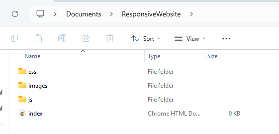
Create a Project Folder: Start by creating a new folder on your computer. Name it something like `ResponsiveWebsite`. Inside this folder, create three subfolders:
`images/` for any images you may use in your website
`css/` for your CSS file
`js/` for any JavaScript files (optional for now)
Set Up HTML, CSS, and JS Files: Open Notepad++ (or any code editor you prefer). Create a new file for your HTML code, and save it as `index.html` inside the main project folder (`ResponsiveWebsite`). Create another file for your CSS, saving it as `styles.css` inside the `css/` folder.
Link Your Files Together: In your `index.html` file, link the CSS file like this:
<link rel="stylesheet" href="css/styles.css">
If you have a JavaScript file, link it just before the closing `
` tag:
<script src="js/script.js"></script>
Adding Images: Place any images you want to use in the `images/` folder. You can reference them in your HTML like this:
This CSS will style your header, sections, and footer, giving the page a clean, minimalistic design.
Step 4: Make It Responsive
To ensure your website looks good on all screen sizes, let’s add media queries to make it responsive. Add the following to your `styles.css`:
@media only screen and (max-width: 600px) {
    header {
        font-size: 18px;
    }
    section {
        padding: 15px;
    }
}
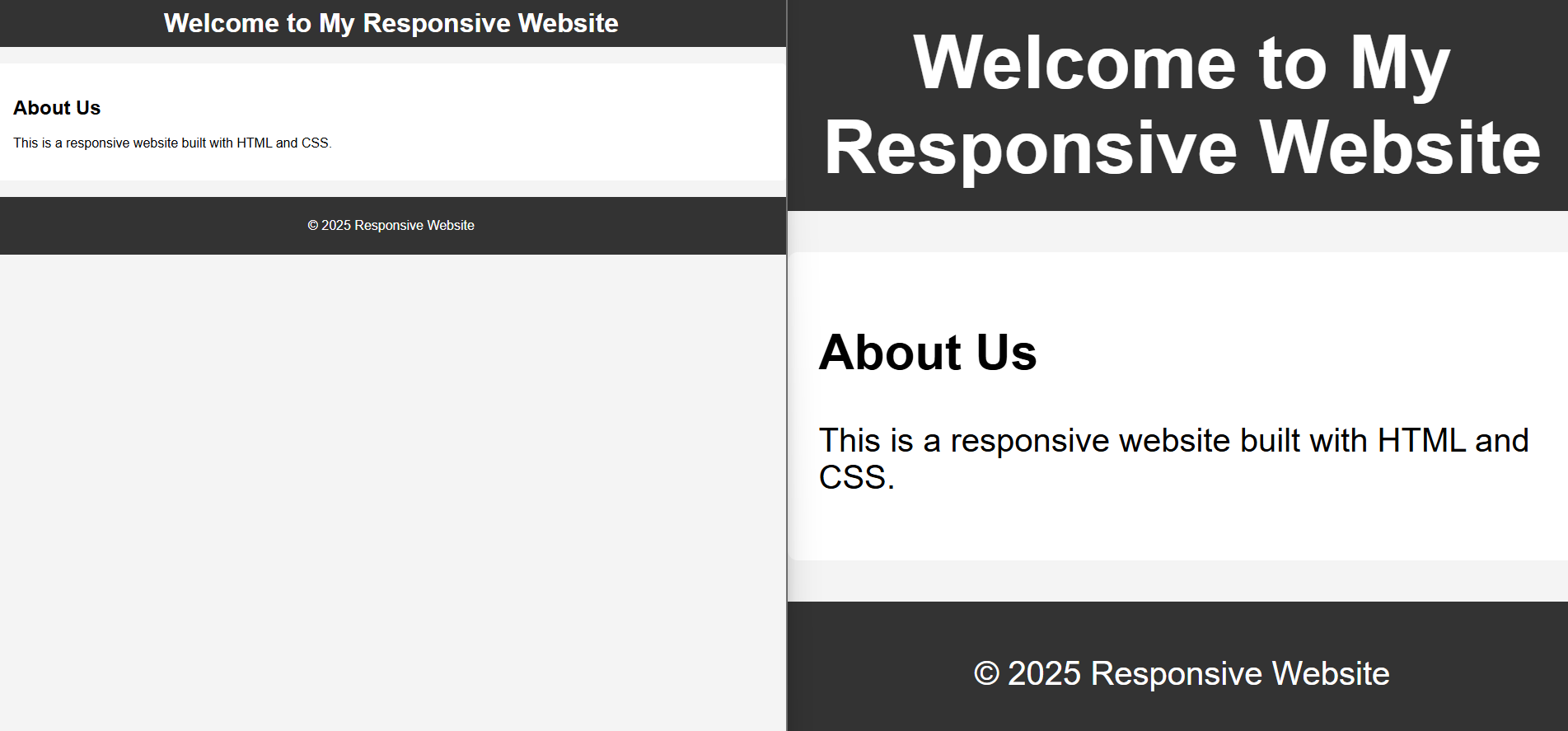
This media query will adjust the font size and padding when the screen width is 600px or less (typically on mobile devices).
Step 5: Test and Refine
Now, open your `index.html` file in a browser and check how it looks. Resize the browser window to see how the layout adjusts for different screen sizes. If you notice any issues, tweak your styles until everything looks great.